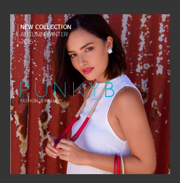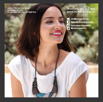
With a change of direction for the jewellery styles and ranges, I needed to reflect this new approach with the seasonal catalogue.
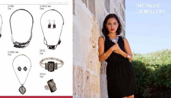
I decided to adopt a more modern size, using a square format as opposed to the traditional A4 Portrait format. This allowed for more dynamism in displaying the various ranges, and made it easier to carry the book aroung.
I also adopted a collection based approach (vs. colour based or type of jewellery based) in order to increase storytelling and ongoing content creation for the campaign launch and communication.


